Hello,
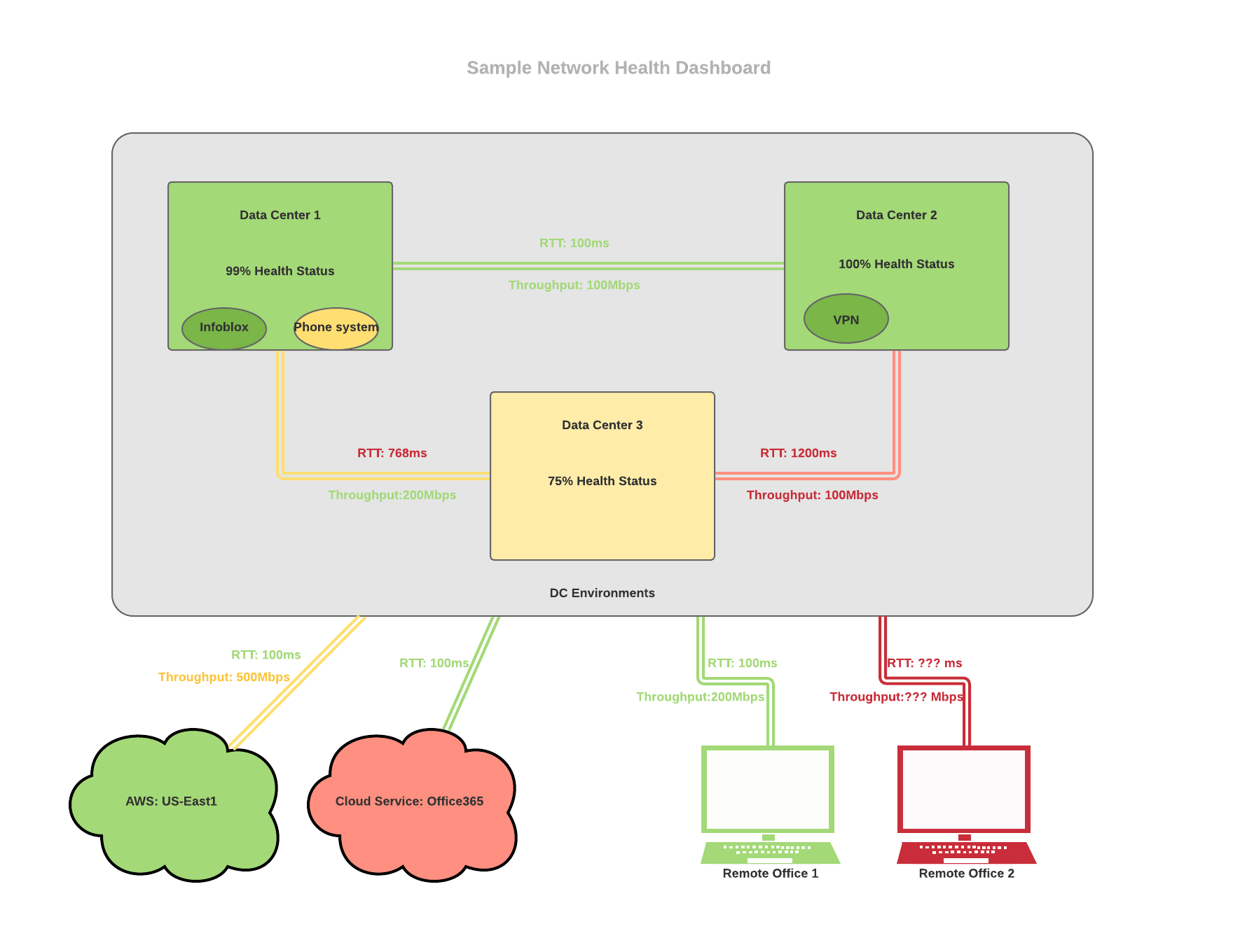
I am being asked to create a dashboard that could relatively quickly identify whether there are any noticeable issues with the network. It could look something like this: https://i.paste.pics/00c549d150a718d5ea2b3b8a1dd0edbb.png
The data would come from all kind of different places (which is another huge problem, but it's a completely different conversation) and I will be collecting it with some kind of scripts, so the format and type of data received is 100% customizable.
Current idea is that data center icon would be displaying the health status of physical gear in the DC, individual services (like VPN, Infoblox, etc) will be showing health of those services - i.e. whether I can get DHCP address and resolve DNS or not, RTT and throughput will be figured out from netflow data, showing red/yellow/green depending on deviation from normal condition and external services like AWS or Office365 would be monitored by some other tools like Thousand Eyes.
So my question is - what would be the best tool to display all of this data in a format that's easy for non-technical people (read - managers) to understand? Doesn't have to look exactly like the mock up I made, but I definitely don't want it to be any more complicated than that.
We do have PowerBI which I believe I can make show things with streaming data, but I am not sure if it will be flexible enough. I could write something of my own, but that will be most likely replicating somebody else's work. Any suggestions for tools/projects that could help me create this kind of dashboard?
Thanks!
No comments:
Post a Comment